Monica from Barcelona (Spain) entrusted us with the corporate identity project for Asbury Park. Asbury Park is a gentlemen's clothing shop which offers casual, formal and sports styles for men from 30 years and above. At the moment it is a multi brand shop, but they have a desire of launching their own brand in the future.
They were looking for an elegant image, which transmitted "quality". They also told us that Asbury Park is a name of a small town, near New York, which was well known for its summer visitors during the 1940's and 50's. The remains of these splendor times are the wooden promenade, the amusement park, the Ferris wheel etc… They asked us to include some proposals which reminds of this small town.
1st proposal list:
Client response: Monica responded that they liked various ideas but they were really fascinated by the isotype of number 1, and they really liked the colors it had. They asked us to make more examples of number 1 applying the fonts from 2, 15 y 16 before making their final decision.
Final result:
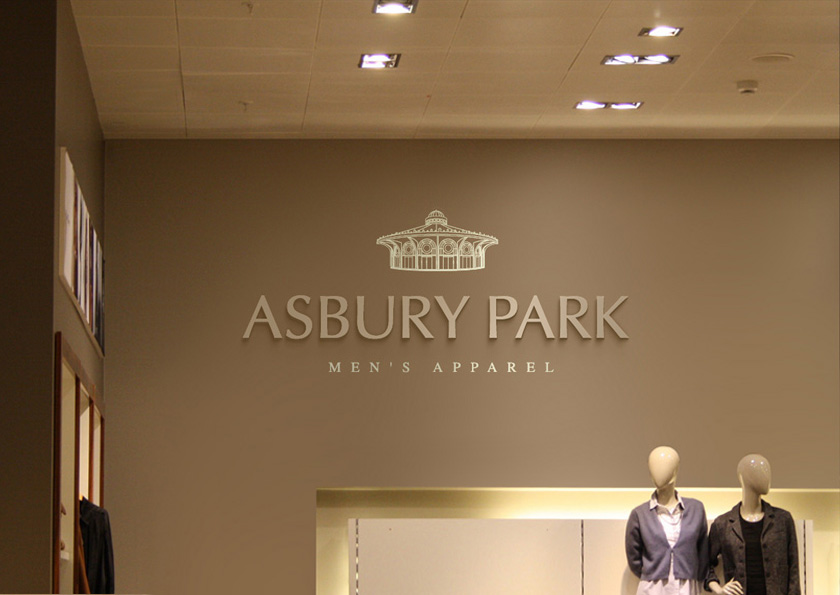
The icon is based in an illustration that we made of the old Casino, which is located close to the esplanade of Asbury Park. We have drawn the outlines of the building using an old photo and we have added a perfect symmetry to create a brand which adjusts perfectly to the objective of the client: a classic and elegant image with a strong personality created to last for many years.

