Judy from Panama City entrusted us with the logo design of Mummy&Co, a franchise of clothing and accessories shops for Moms and babies. Our client decided that it was time for an image change and they wanted to launch it together with the opening of a new shop. They looked for a modern, ingenious and likeable logo.
After sending us a small briefing and making the 50% advance payment, we started developing different ideas, icons, fonts, colors...
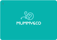
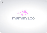
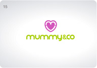
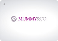
1st proposal list:
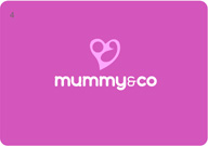
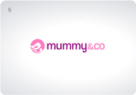
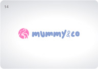
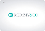
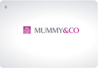
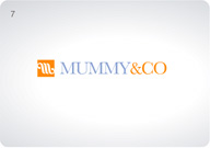
Client response: Judy told us that she liked number 13 y 16. She asked us to develop more ideas towards number 20, which uses the "M" as an icon and has a classic and elegant font. This is the concept that several competitive brands use, which is why she wanted to see more ideas following this style.
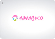
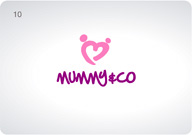
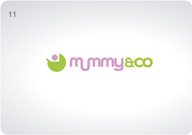
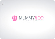
2nd proposal list:
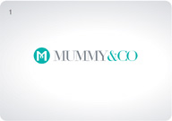

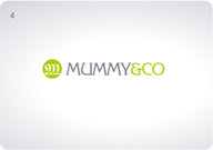
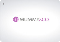
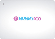
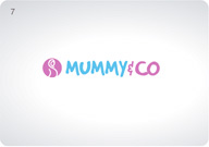
Client response: Finally Judy decides to go with idea number 13 from the first list of proposals. She wanted it exactly as it was, but she wanted to try on different color tones and the possibility of having the entire text in just one color.
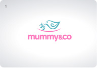
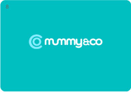
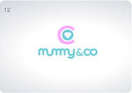
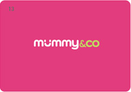
Final result:
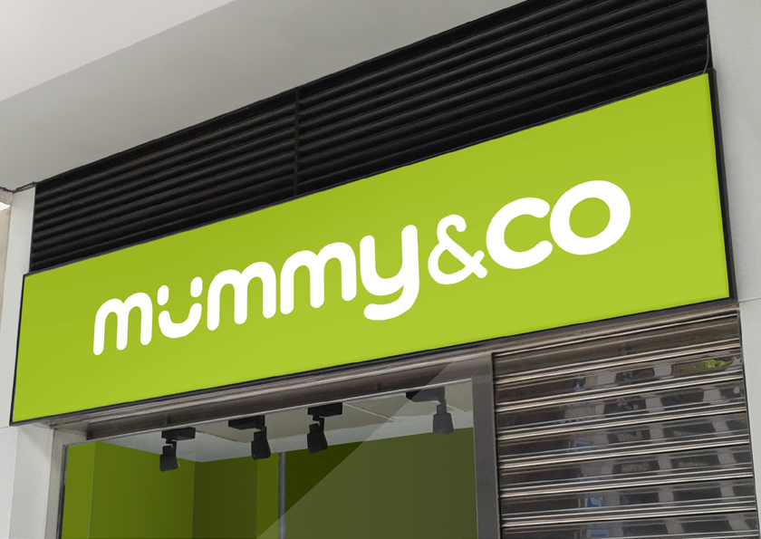
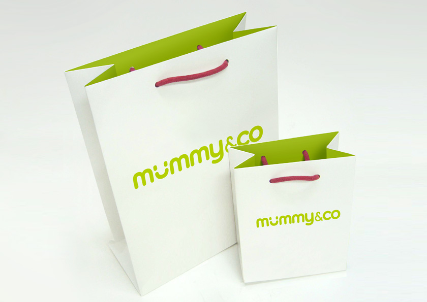
The final logo design is based on one letter type written in small letters with rounded lines to transmit proximity and friendliness. A smile (which also reminds of a rocker for children) substitutes the "u" giving it an original and amusing touch that brings attention from the first moment. We have written the "&" with a finer line so it stands out from the rest of the name. The corporate color is a tone of light green, a color which is not associated with any gender in particular and which gives a fresh, modern and cheerful image.