Natalia Lou from Zaragoza (Spain) requested us to design a logo for their law firm. Their objective was to transmit a modern, elegant and professional image. They told us that the logo is of great importance as their intention is to communicate and sell their services through many different advertising channels. The word "lawyers" should appear in Spanish, Russian and English.
From these indications we started to develop different ideas until we reached 16 proposals.
1st proposal list:


Client response: Natalia commented that they liked various ideas and they requested that we continued developing on the idea 4. They liked the color combination of dark blue with light blue and dark blue with orange. They wanted us to make two versions of these color combinations on a white back ground.
2nd proposal list:
Client response: Natalia told us that they liked the fonts and icons from proposal 11 and 12, but they asked us to try out thicker lines inside the isotype. They chose the color combination of dark blue with light blue.
3rd proposal list:
Final result:
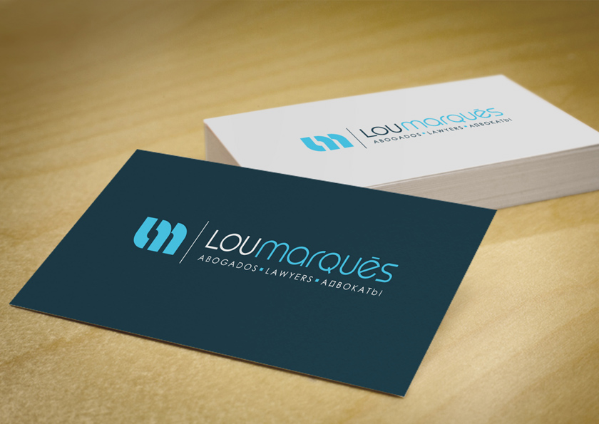
The final logo bases its icon in a simplified combination of the initials of the name "L" and "M". The font used continues the geometric and minimalistic style of the icon. The letters have been personalized one by one, combining capital and small letters to create a perfect harmony. The result is a modern and elegant logo which stands out in a sector that generally uses images more conservative.

